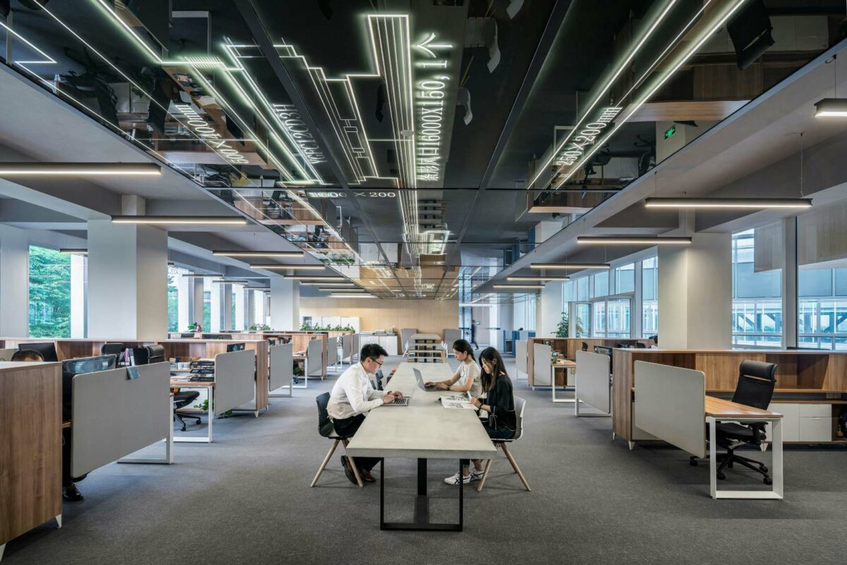
Anybody who has seen ‘The Office’ will be able to recall the iconic aesthetic of the Ricky Gervais and Stephen Merchant show: bland, flat and devoid of colour. Like all great observational comedy, the show understood its subject matter perfectly, and was in fact inspired by Gervais’ time spent working in offices.
However, businesses across all industries – from digital start-ups through to traditional professions such as accountants and law firms – are now striving to create workplaces that inspire their staff through the use of art, colour and/or other visual stimuli.
Of course, the current pandemic means millions of us are now working from home. But regardless of where we are, it’s more important than ever to understand how we can get the most out of our workspaces and our working days. And one way of doing this is delving deeper into the colours surrounding us. How we use colour in both our offices and home workspaces can have a tangible impact on how we feel while sat at our desks, and how productive we are.
Colour matters
We know that colour can contribute to productivity, happiness and physical and mental health when used well in a working environment. Karen Haller in her book The Little Book of Colour states that more and more employers are beginning to understand that colour is just as vital to our health and wellbeing as natural light, air quality, ambient temperature, the furniture, and proper food in the canteen.
We are now seeing many companies break free of the traditional approach of sticking to their corporate branding or tones that we might think of as naturally cheerful when designing. For example, simply opting for yellow throughout no longer cuts the mustard. While yellow is associated with evoking feelings of warmth, creativity and optimism, especially as it tends to remind us of the happy thoughts of sunshine, summer and vacations, our use of colour needs to reflect the wide spectrum of tasks that we undertake in modern workplaces in its sensitivity and variation.
Blue historically has connotations of bleakness and sadness, but in fact it has been shown to be associated with increased brain activity and creativity. Indeed, Pantone, the renowned authority on colour, chose Classic Blue as their shade for 2020, stating that it instils: ‘calm, confidence and connection.’
In particular, lighter blues can help calm the mind and aid concentration, while strong blues help to stimulate clear thought. Furthermore, secondary colours can be used to create other effects. Purple, as a blend of calming blue and intense, energising red, is believed to induce creativity.
Nature’s influence
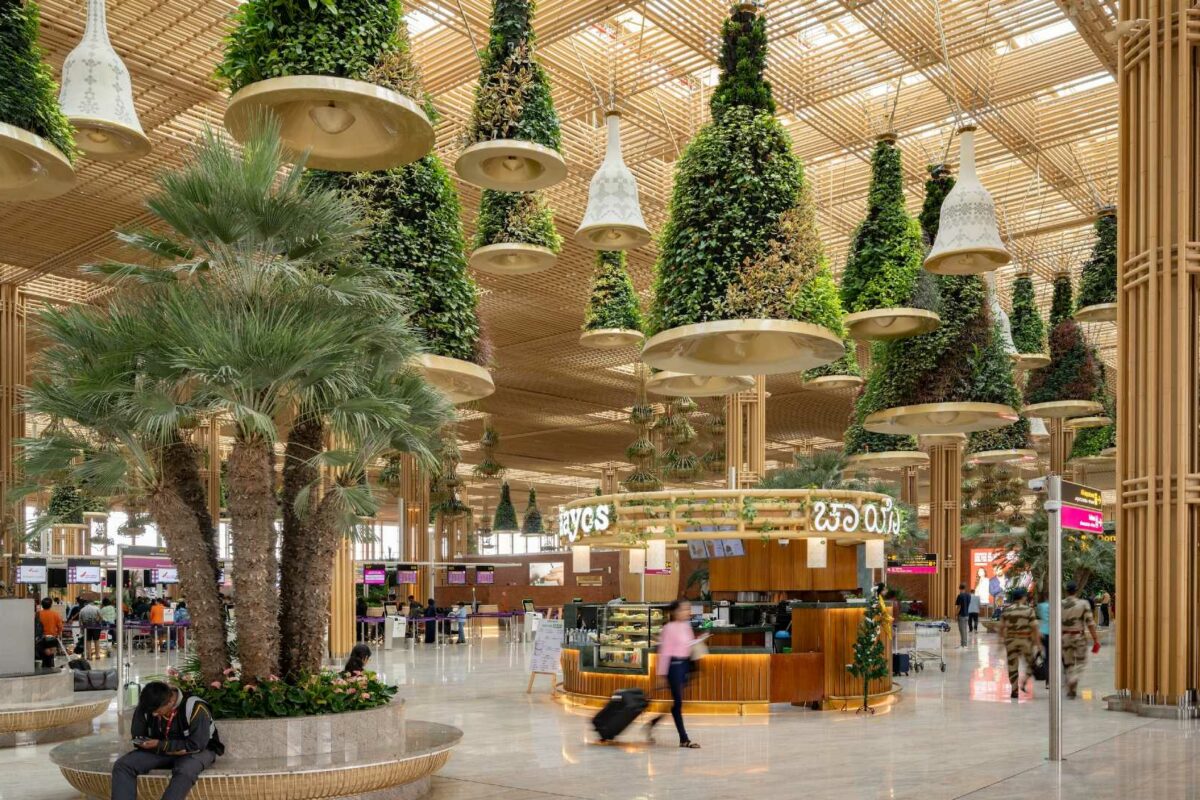
Natural colours have also proven effective, as designers look further than biophilia when it comes to bringing the outdoors inside. Green, the obvious choice of nature’s colours, is revealed to be calming as it gives connotations to nature, fresh air and plant growth. Neutral brown tones give a sense of grounding, with a combination of darker earth tones said to be more stimulating, as well as giving users a sense of freshness and simplistic beauty.
However, it’s not just a lick of paint that solely makes this happen; it’s a combination of the colour, lighting and other environmental features. With this in mind, it is important for architects, interior designers, graphic designers and the client to collaborate early to ensure the best combination is found.
Pepper-potting the workplace and our homes with art can also have a beneficial impact on wellbeing and productivity. This is especially relevant at this present moment, when so many of us are cooped up indoors at home in need of inspiration and motivation.
The health impact
Dr Craig Knight, an expert in the field of the psychology of working environments, heads a research group called Identity Realisation (IDR). He has demonstrated that art installations, if designed well, can improve the health of workers.
His research urges that an enriched workplace can contribute to increased happiness and productivity levels remaining high. The study found that participants who worked in an enhanced space were approximately 15% quicker in completing tasks than those who worked in the lean workspace.
Interestingly, German investment bank, Deutsche Bank has the largest collection of corporate art in the world, with 60,000 artworks across 900 offices in 40 countries. The collection is accompanied by an app to educate employees about the art they are looking at, enhancing their workspace as a place to learn outside their usual day-to-day routine.
As the COO of London art consultancy Artiq, Katie Terres, says, “art has a powerful impact on us; the content, style, medium(s) and context can change how we feel, act and how productive we are. Whether you’re designing for an office, residential project or mixed-use development, engaging those different communities in the selection has been proven to increase productivity and wellbeing. Choice is key, and this isn’t overwhelmingly difficult to coordinate by curating different options for people to choose from.”
So, let’s get creative and continue to delve deeper into the effect of colour and art in our workspaces, whether this is a traditional office or home studio. With so much focus on improving wellbeing in workspaces through furniture, break-out spaces and lighting, we as both commercial and residential designers need to bring the importance of colour to the forefront to ensure it is recognised in the early stages of design.
Ben Channon is Head of Wellbeing at Assael Architecture. For more of Ben’s content for Work in Mind, click here.
Content Team
Work in Mind is a content platform designed to give a voice to thinkers, businesses, journalists and regulatory bodies in the field of healthy buildings.
